Design Studies: Denver split-level
Vintage treasures collected infuse this contemporary home with history and soul
Objective
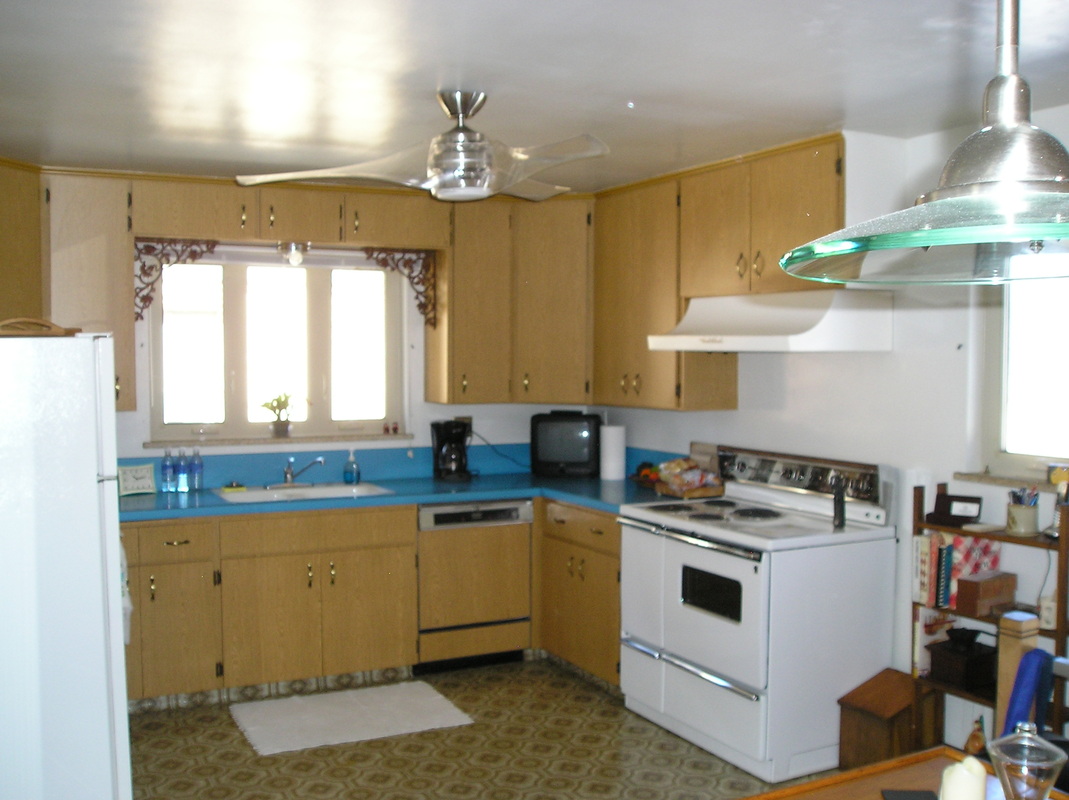
The goal of the project was to update the small 1950s split- level ranch home by creating an open entertaining floor plan and a kitchen that is unique and original on the main level. As well as divide the lower level space to create a luxurious master suite and a media center for relaxation. All while creating a home that serves as a gallery for the clients’ favorite antiques and vintage finds.
The goal of the project was to update the small 1950s split- level ranch home by creating an open entertaining floor plan and a kitchen that is unique and original on the main level. As well as divide the lower level space to create a luxurious master suite and a media center for relaxation. All while creating a home that serves as a gallery for the clients’ favorite antiques and vintage finds.
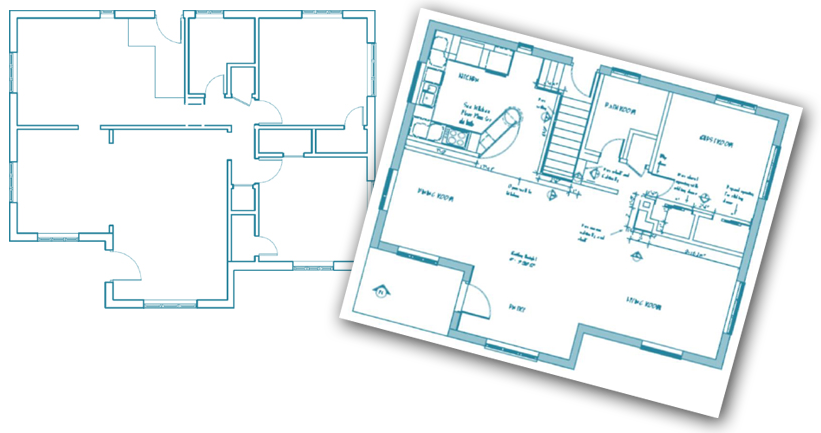
Floor Plan
Removing outdated architectural features and opening three small rooms created a large, clean, modern living space. Exposing the kitchen created new site-lines and the open entertaining floor plan the clients desired.
Removing outdated architectural features and opening three small rooms created a large, clean, modern living space. Exposing the kitchen created new site-lines and the open entertaining floor plan the clients desired.
Inspiration
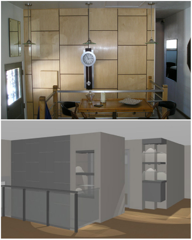
The design inspiration was influenced by a square paneled accent wall, a personal touch that the clients had created together. Their desire to incorporate this in the design was the inspiration point and functioned as the primary design element that unifies the entire home.
Accent Wall
Several options were considered for the accent wall, including repeating the square panels and wrapping them around to the front living room. However, this would have closed off the kitchen hallway entrance entirely, thus creating a dark hallway. The resolution was to design open shelving that mimicked the squares, allowing natural light to reach the hall.
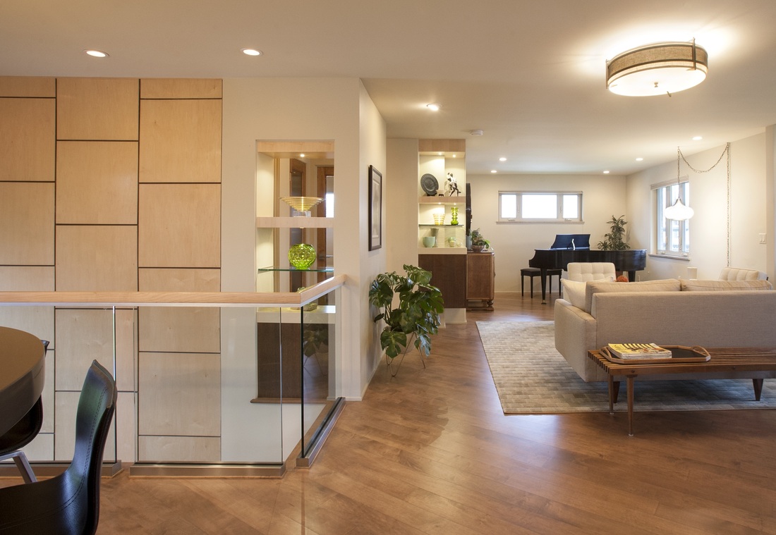
In the living room, the built-in corner cabinet repeats the wall design, creating a cohesive look while allowing a see-through view, eliminating a hard right angle and softening the space.
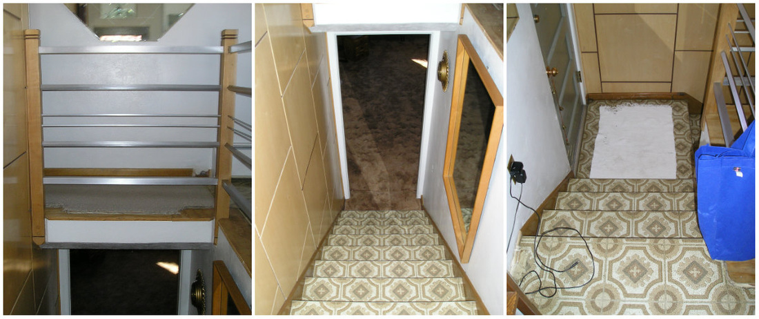
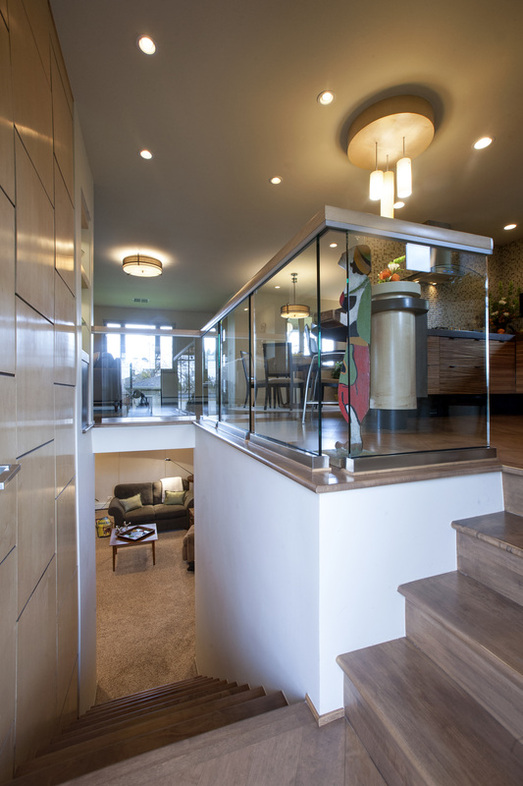
Removing part of the floor opened up the lower level entrance, visually expanding what was an otherwise cramped stairwell.
Replacing the bars on the stairway railing with glass eliminated competing horizontal lines from the square panels which visually cluttered the tight space.
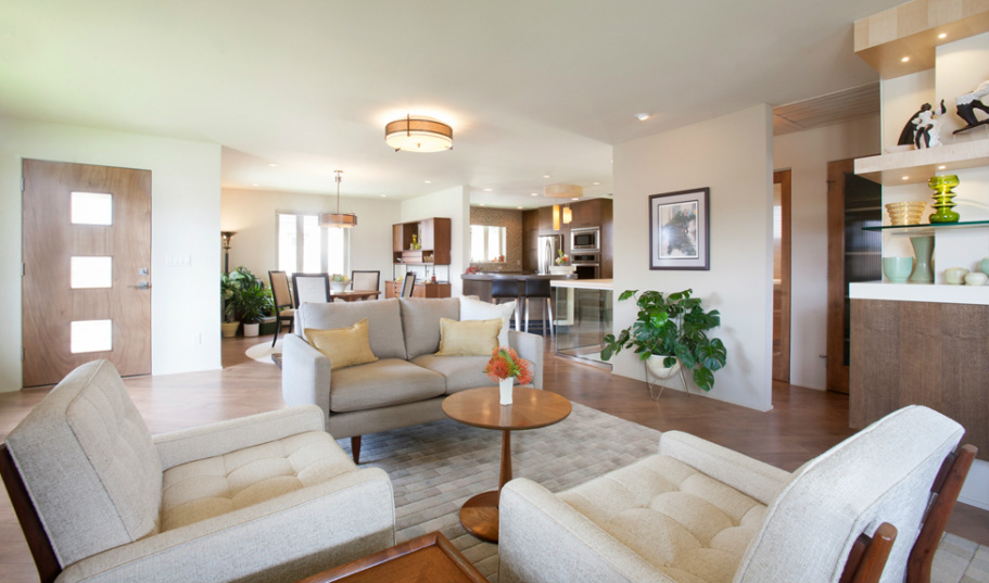
Replacing the solid front entry door with custom three square glass panels not only extends the design to outside but, allows light to filter into the room.
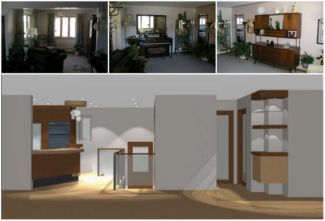
A “less is more” approach to their existing furnishings ensures that collectible treasures are well displayed, while the modern built-in cabinets create a worthy home for vintage finds.
The entire home’s color palate was kept to muted neutral hues to create the illusion of larger spaces and help reflect the natural light within the rooms.
Replacing the bars on the stairway railing with glass eliminated competing horizontal lines from the square panels which visually cluttered the tight space.
Replacing the solid front entry door with custom three square glass panels not only extends the design to outside but, allows light to filter into the room.
A “less is more” approach to their existing furnishings ensures that collectible treasures are well displayed, while the modern built-in cabinets create a worthy home for vintage finds.
The entire home’s color palate was kept to muted neutral hues to create the illusion of larger spaces and help reflect the natural light within the rooms.
|
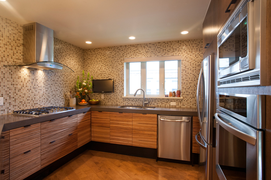
Kitchen
Eliminating the upper cabinets in this fifty-year-old kitchen visually enlarged the space while creating a clean modern feel. The black 10” toe kick was designed to make the custom Zebrawood cabinets appear to float, expanding the floor space and visually enlarging the kitchen. Raising the counter two inches created a personal comfort working height of 38” for the clients. The design of the peninsula’s round end-cap was created to provide a sense of drama and give the clients that unique one-of-a-kind design they sought. |
|
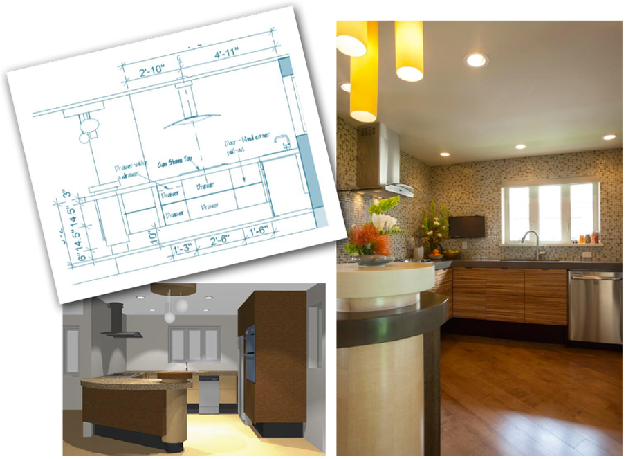
Designing the peninsula was a space challenge. To both build the island and allow for enough space to walk around while seated, the peninsula was placed at an angle and its cabinet depth reduced from a standard 24 inches to 18 inches.
The new solid wood floors were placed at the same angle as the peninsula, breaking up the boxy feel of the home’s footprint and visually widening the new open floor plan.
Interest was created in the neutral palate through the use of visual textures within the Zebrawood and in the custom mosaic tile wall.
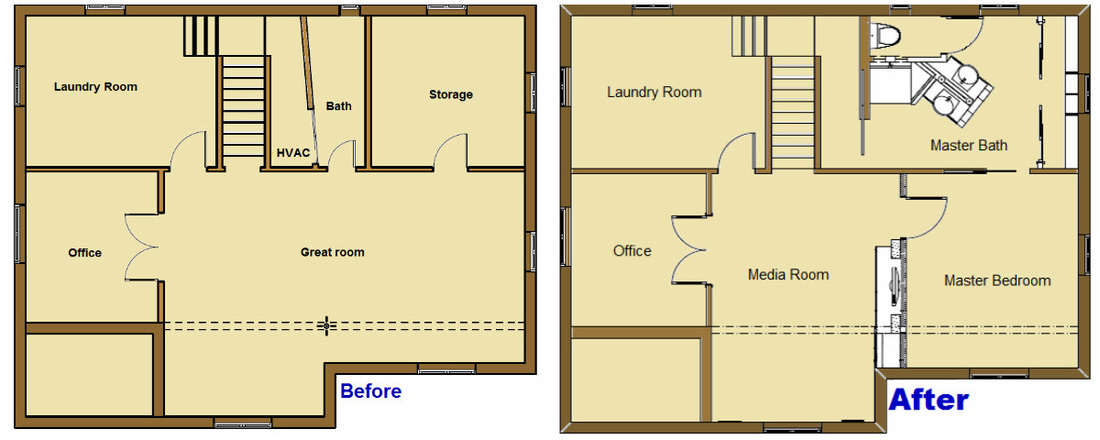
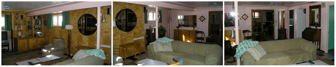
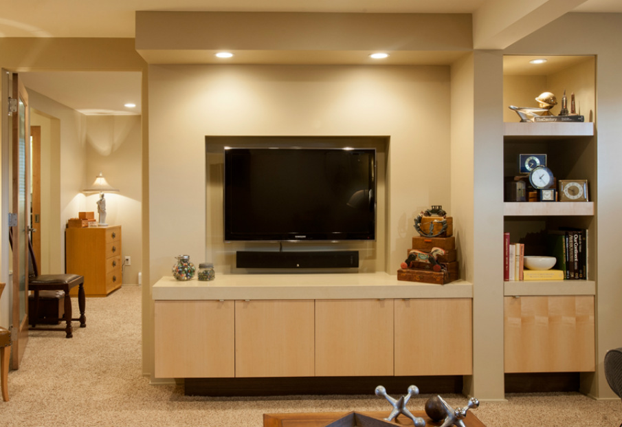
Basement
The large lower level family room was divided and used to create a media center and a master suite.
An existing pink support pole worked as a natural dividing point between the two spaces. Encasing the pole into a short wall and creating built-in shelving served to house collectibles and support the floating media center.
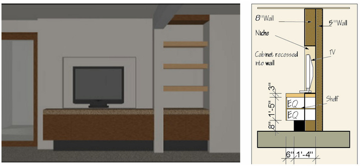
Creating a 13” thick wall allows for recessing the TV and custom cabinets while minimizing the noise to the adjoining bedroom.
The 22” deep recessed cabinets only reveals 14” reducing the bulky appearance.
Recessing the TV retains a clean look.
The 22” deep recessed cabinets only reveals 14” reducing the bulky appearance.
Recessing the TV retains a clean look.
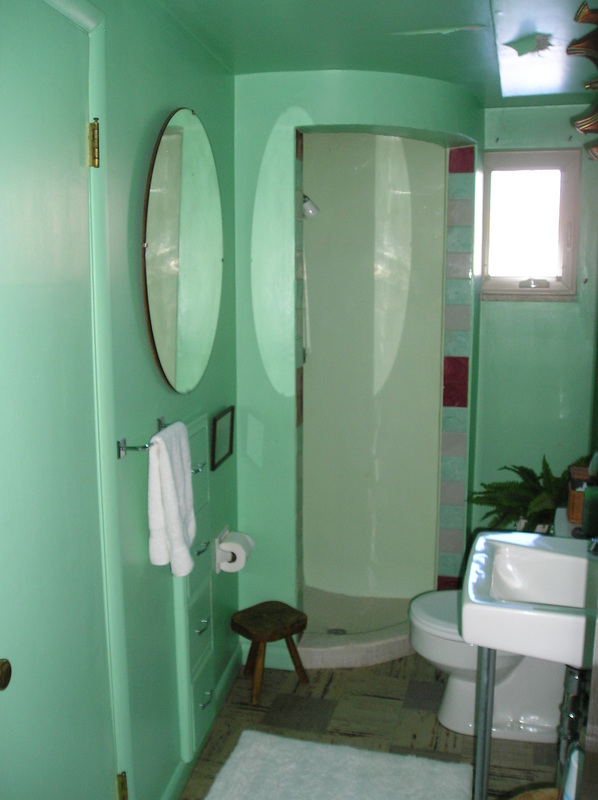
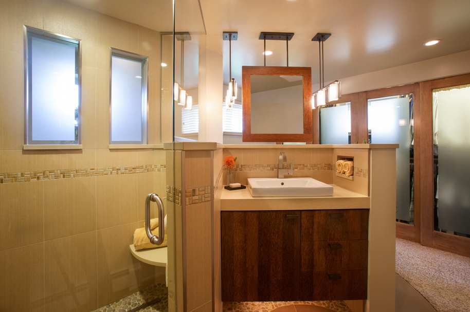
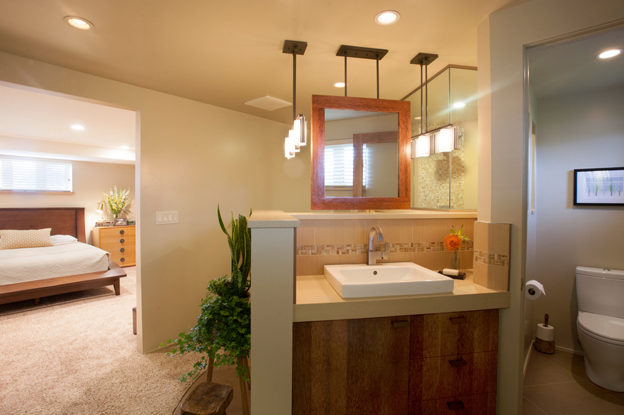
Since the original bathroom was tiny, removing the wall to an adjoining storage area provided the space needed to create the clients’ luxury master bath.
Angling the plumbing wall served to conceal the dual sinks and created a niche for the shower bench. Placing a pony wall at the end of the angle gave the clients a place to display vintage treasures. |
Master Bathroom
By far the greatest challenge of the project was incorporating all the elements of the clients’ wish list for the master bathroom. These included: using the original plumbing wall for budgetary reasons; including dual back-to-back sinks that would not be visible from the entrance; creating a focal wall for vintage furniture; doubling the existing closet space; accommodating a separate water closet; providing a walk-in shower with bench; and maximizing sunlight in an otherwise dark lower level. 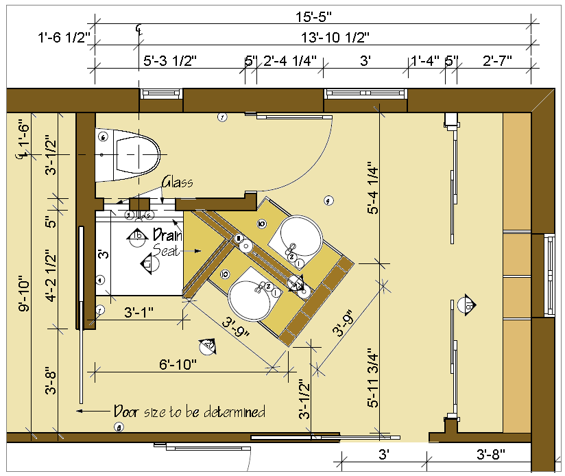
|
|
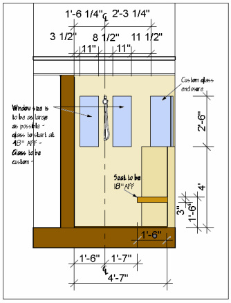
Constructing windows in the shower wall to the adjoining water closet helped to move the natural light from side to side.
Using frosted glass doors throughout the entire house also enhanced the flow of light and created the illusion of additional space. 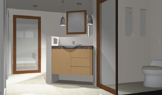
|
|
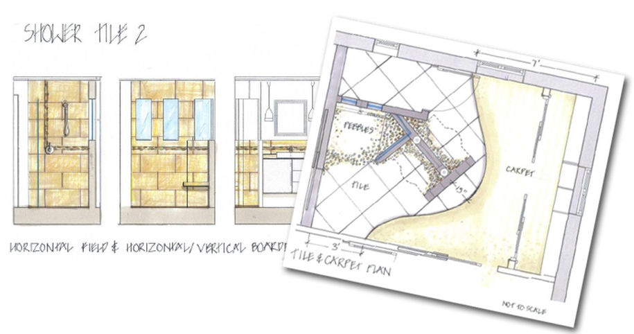
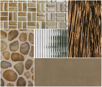
Natural Coconut Palm wood was used for the custom vanities. The shower floor was composed of pebbles, which spilled out and under the floating cabinets to create the organic feel the clients desired. The carpet contour lends itself to the Zen-like feel.
|
|