
Design Studies: San Diego Ranch Home
Redesigning a Home on a Budget Can Create More Efficiency Plus a Great Deal More Style
Objective:
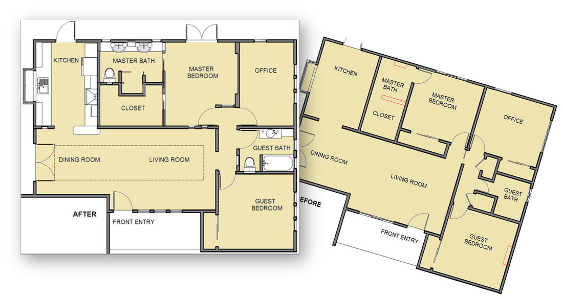
The primary goal of the redesign was to update an outdated 1950s ranch-style home. The secondary goals were to reconfigure the floor-plan for easier access from room to room, improve traffic patterns and maximize the space in each room for added comfort and efficiency. Adding insulation inside the walls and replacing the outdated doors and windows achieved the added benefit of reducing energy usage and cost.
The primary goal of the redesign was to update an outdated 1950s ranch-style home. The secondary goals were to reconfigure the floor-plan for easier access from room to room, improve traffic patterns and maximize the space in each room for added comfort and efficiency. Adding insulation inside the walls and replacing the outdated doors and windows achieved the added benefit of reducing energy usage and cost.
Floor Plan:
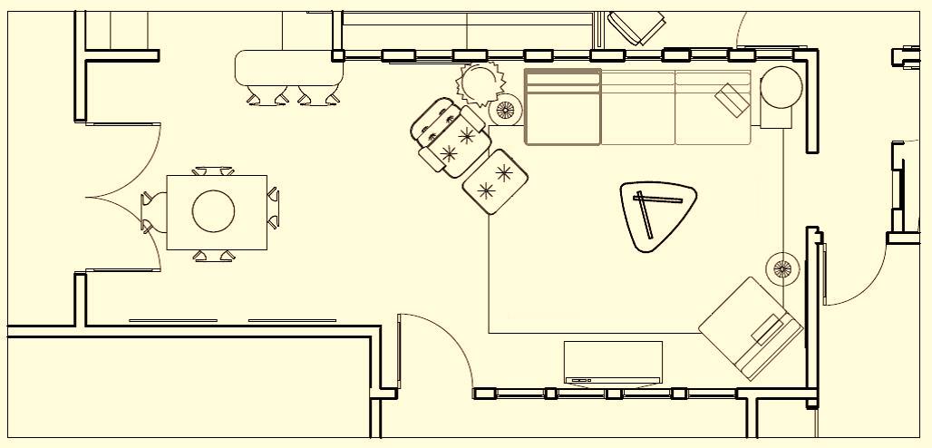
As part of reconfiguring the floor plan, the front door and entrance was move to the opposite end of the porch. This eliminated the foot traffic that once cut through the center of the room. The hallway and the entrances off the hallway to the master bedroom and office were moved for more convenient access as well as privacy. By borrowing three feet from the adjacent office, square footage to the master suite was increased considerably. The added square footage contributed to the size of the walk-in closet and master bathroom, which now has a nice sized shower. By eliminating two unnecessary hall closets, space and efficiency was added to the guest bathroom and turned a tiny guest bedroom into a comfortable retreat.
As part of reconfiguring the floor plan, the front door and entrance was move to the opposite end of the porch. This eliminated the foot traffic that once cut through the center of the room. The hallway and the entrances off the hallway to the master bedroom and office were moved for more convenient access as well as privacy. By borrowing three feet from the adjacent office, square footage to the master suite was increased considerably. The added square footage contributed to the size of the walk-in closet and master bathroom, which now has a nice sized shower. By eliminating two unnecessary hall closets, space and efficiency was added to the guest bathroom and turned a tiny guest bedroom into a comfortable retreat.
Living Room & Dining Room:
|
|
|
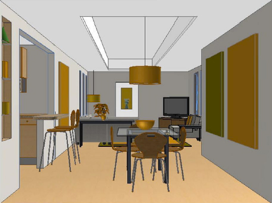
Relocating the entrance to the living room from the hall created a focal point opposite the entrance that can be seen while dining, making the living room appear larger.
|
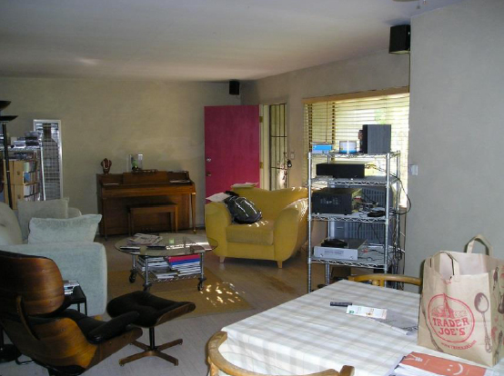
By moving the front door and entrance to the opposite side of the porch, foot traffic through the living room is now kept to a minimum.
|
|
|
By expanding the entrance to the kitchen, space is created for a counter and the site lines to the living room and front door are opened up.
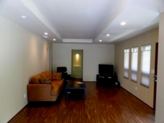
Adding a raised cove to the living room ceiling creates architectural distinction and adds volume to the room itself.
Adding a raised cove to the living room ceiling creates architectural distinction and adds volume to the room itself.
|
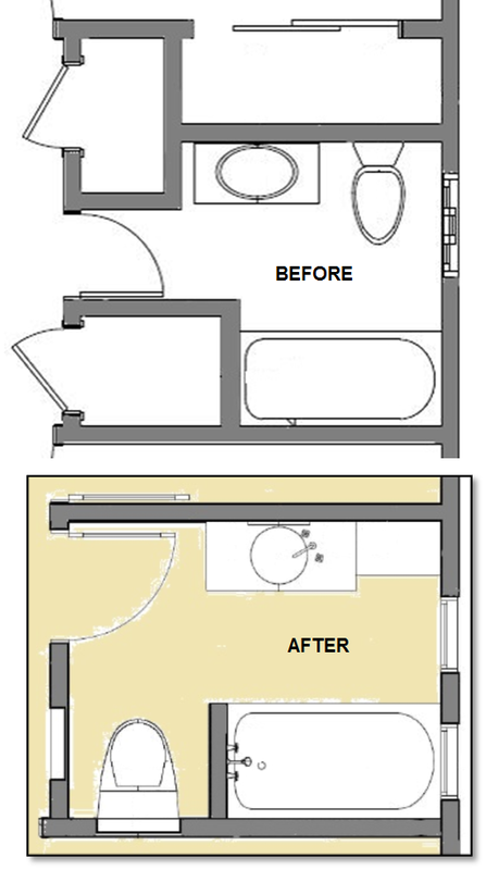
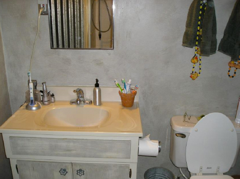
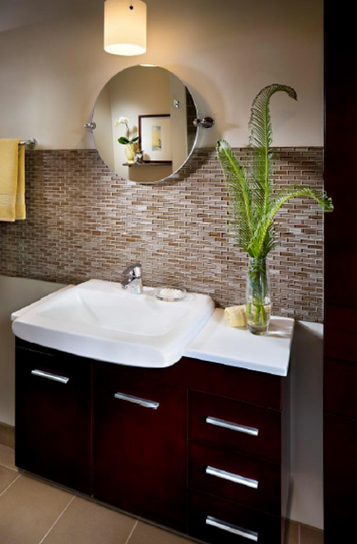
Guest Bathroom: A larger footprint for the guest bathroom was important to the client. This was achieved by eliminating two unnecessary hall closets that flanked the entrance to the bathroom while only allowing for a narrow 26” hallway entrance. The added space allowed the toilet to be relocated, adding privacy and needed cabinet space for storage. By replacing the existing vanity with floating cabinets, more floor space could be revealed, which makes the bathroom appear even larger. New cabinets were chosen to maximize space while the contemporary design and ebony color added to the new look of the outdated bathroom. 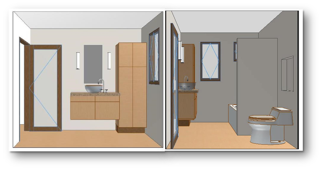
|
|
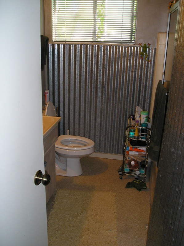
By replacing the corrugated metal wall covering with glass tile in earth tones, encircling the entire room, a modern look of continuity was created in the guest bathroom. This also added an interesting visual texture to the room. To create a bright, uplifting space, the dark grey walls were painted a soft taupe, which reflects the light. An expansive 12” X 24” slip resistant techno bronze floor tile was laid to add beauty, safety and tactile texture underfoot.
|
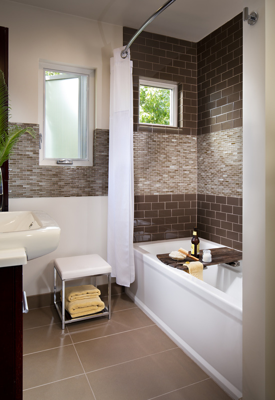
Grohe chrome fixtures add sparkle and interest, while keeping the budget intact. The round vanity mirror contrasts with the boxy look of the space and complements the circular light pendant above.
|
|
|
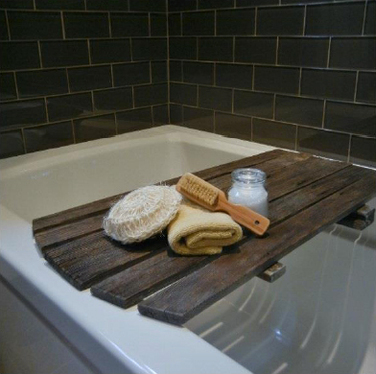
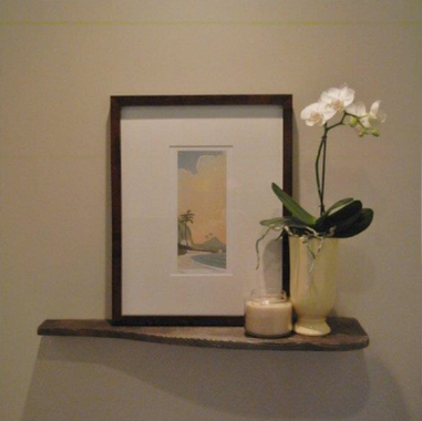
To add warmth and a sense of nostalgia, a cherished vintage Adirondack chair salvaged from the family’s vacation cabin destroyed by fire, was transformed into a decorative wall shelf and a tub caddy, adding utility and character to the redesigned guest bathroom.
Master Bedroom:
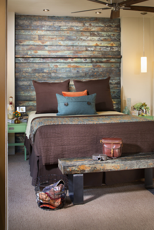
To create a more expansive looking master bedroom, French doors replaced an ordinary picture window, allowing in more light and access to the outdoors. A narrow bedroom closet was eliminated providing for more living space. Using a row of frosted windows along the west wall allows light to filter into the previously dark living room. Another window was installed in the hall creating the perfect spot for displaying a collection of Disney memorabilia while providing additional light.
Borrowing three feet from the adjacent office allowed the master bathroom to expand. Room was also made for a custom niche for the bed, which was clad with recycled boat lumber. A landing space or bench, placed at the foot of the bed, was built from the same recycled wood, adding convenience and continuity.
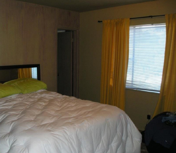
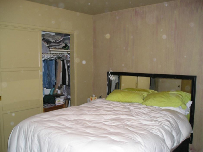
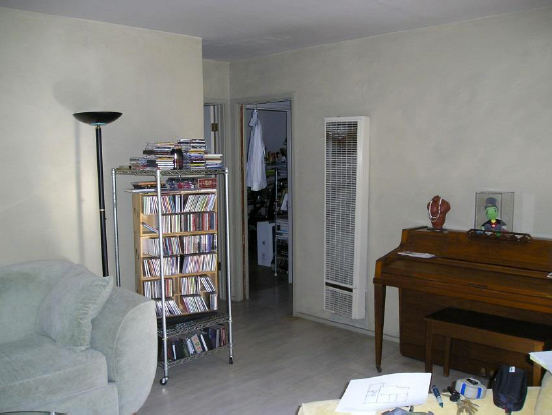
The original room was small, cramped, dark and confining.
|
|
|
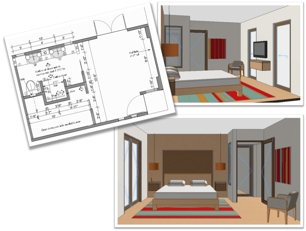
Master Bathroom:
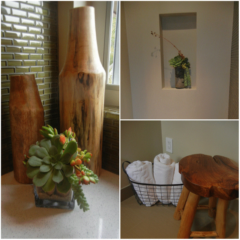
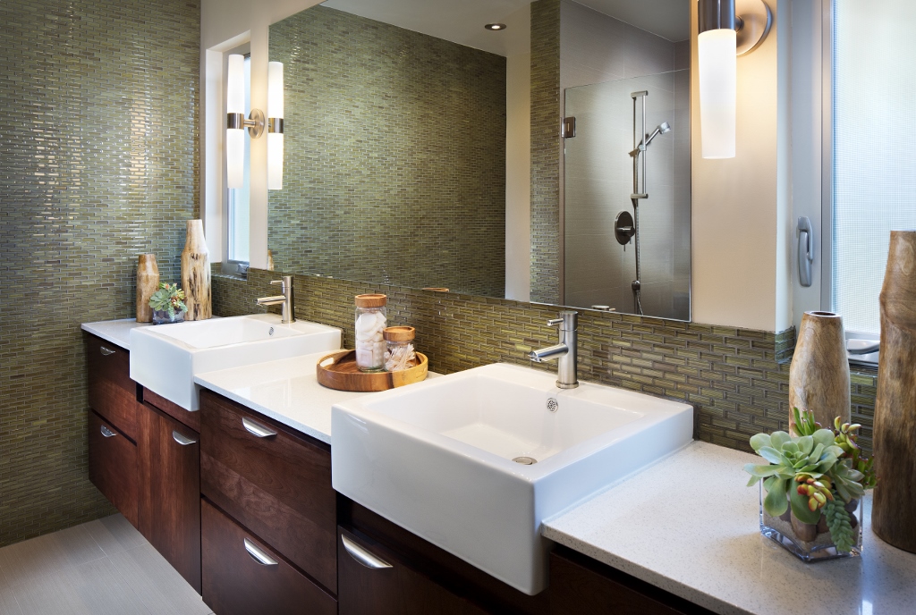
The long narrow master bathroom shrewdly carved enough space from the adjacent walk-in closet to make space for a dramatic glass-enclosed walk-in shower, adding needed width to the room. The zero-threshold shower gently slopes down to the custom Mickey trench drain allowing for easy access. The dual floating vanities reveal more floor space, once again creating the illusion of a wider room. The large 12” X 24” textured floor tile was laid width-wise, which adds to the illusion. 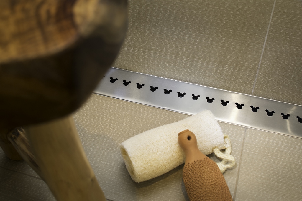
To create a “wow factor” a focal wall was tiled with small green mosaic glass, adding sparkle and texture. A vanity mirror was installed that stretches the length of the wall above the cabinets. The size of the mirror expands the look of the room by creating depth. Pocket doors were used for convenience and to maximize wall-space in the entrances of both the master bath and closet.
|
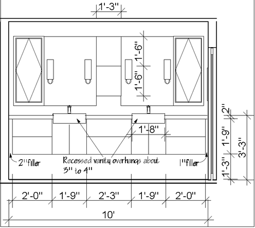
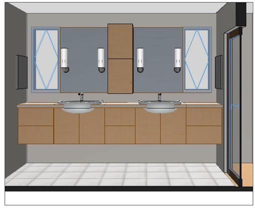
In this rendering of the original concept you can see that the homeowner desired upper cabinetry in order to separate the two vanity sections. In the end the client opted for a cleaner, more streamlined look.
|

Frosted glass doors were used throughout the house allowing light to filter through and open up the spaces to visually expand the size of the rooms.
